 I keep reading recommendations for using EMs or other typographical units for layout, which I still don’t understand. At best it is an extra layer of abstraction, at worst it is misleading and likely to cause more issues than it solves. I will try to demonstrate why pixels is the best relative unit.
EMs for layout
A recent example is an article by Steve Hickey on EMs for layout in my favourite web-design & dev magazine .net (ok, I may be biased as I also write for them!).
I struggle with the positive reasons for using EMs for layout though:
using pixels as a measurement unit messes up zooming for users who require it because it declares your font-size in units that are locked to a physical property of your screen.
That hasn’t been an issue since IE6, all browsers now default to a zoom mechanism which increases the size of all elements on the page. With the exception of a glaring Webkit bug, zoom and pixel-based media queries work very well for accessibility in IE and Firefox.
Also, what is wrong with using a unit that is a property of your screen?
As far as I can tell, browsers have to convert EMs (and other units) into CSS pixels anyway, so using EMs simply adds another layer of abstraction. It makes sense for managing CSS when relatively sizing your text, but not for layout.
it’s more theoretically pure to use ems for measuring type because it’s a typographic measurement, and if you’re already defining your content parameters in a typographic unit of measurement and proportion, it makes sense to apply the same idea across the rest of your layout as well.
It might be theoretically pure to use a typographic measurement for typography, but that doesn’t mean it transfers to layout. Making the layout relative to the device makes a lot more sense to me, i.e. percentages or pixels. That way the layout can flex to the resolution of the screen, whereas EMs may not be relative to the screen.
Hi PPI devices
Think about the difference between and iPhone 3 and iPhone 4 (“retina”) display. The iPhone 4 literally has 4 times the pixels (double height and double width) compared to the previous versions, making it a high PPI device.
If “a pixel is a pixel”, regular text would be unreadable. Therefore Apple doubles the width and height of everything on the screen, so it looks the same size (but sharper).
Engadget posted some pictures of the difference at the release of the iPhone 4:
In browser terms you do this using “CSS pixels”, where a CSS pixel can be bigger or smaller than the “device pixel”.
Talking about the future, Steve Hickey says we should move away from pixels:
instead of thinking in an abstract measurement system of device pixels, why don’t we just fall back to real-world measurements? And as luck would have it, we already have a basis for this system: points and ems.
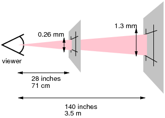
But this misses a vital point about screen devices – variable viewing distance.
The W3C spec uses a CSS reference pixel to allow CSS pixels to vary by device based on viewing distance:
Without the abstraction layer of CSS pixels, text readable on your phone (e.g. 0.5cm high) would be unreadable on a desktop or TV device.
How many CSS pixels per inch?
I did a few tests to see what various devices would report as their CSS pixel-width. Then I divided the device pixel width by CSS pixel width to get the ratio. Then I divided the PPI by the ratio to get CSS pixels per inch (CSS PPI).
A lower CSS PPI will make page elements look bigger.
| Device | Device pixels | CSS pixels | Device PPI | Ratio | CSS PPI |
|---|---|---|---|---|---|
| Phones and small tablets | |||||
| iPhone 3GS | 480×320 | 480 | 163 | 1 | 163 |
| iPhone 4S | 960×640 (614,400) | 480 | 326 | 2 | 163 |
| Galaxy Nexus | 1280×720 | 598 | 316 | 2.14 | 147.7 |
| Nexus 7 | 1280×800 | 966 | 216 | 1.33 | 162 |
| Pad mini | 1024×768 | 1024 | 163 | 1 | 163 |
| Large Tablets | |||||
| iPad 1 / 2 | 1024×768 | 1024 | 132 | 1 | 132 |
| iPad 3 / 4 | 2048×1536 | 1024 | 264 | 2 | 132 |
| Laptops / Desktops | |||||
| Macbook Air 11 | 1366×768 | 1366 | 135 | 1 | 135 |
| Macbook pro 15R | 2880×1800 | 1440 | 220 | 2 | 110 |
| Dell 19″ Monitor | 1600×1200 | 1600 | 105 | 1 | 105 |
| TVs | |||||
| IE/Xbox on 32″ HDTV | 1920×1080 | 1050 | 69 | 1.83 | 37.7 |
NB: If you have another device you’d like to add, please do check this page and tell me what the device is and the reported widths are.
You can see that small devices you hold close have a high CSS PPI, and large displays you view from a distance have a smaller CSS PPI. Also, despite the higher resolution of the Macbook Pro 15″ Retina, text is actually bigger on that screen than the 11″ Macbook Air.
I draw three conclusions from this table:
- Devices in the same category can have wildly different device PPI. Therefore device pixels are not a useful measurement for web design.
- The CSS PPI decreases relative to the assumed distance of viewing, and each class of device is within a certain range.
Therefore CSS pixels are a useful relative unit across device types. - The device PPI does not map easily to the size of the CSS pixel on non-Apple devices. Apple uses a straightforward multiplier, but other devices do not.
Therefore you cannot rely on images that use sizes under 1 CSS pixel.
With various devices out there (and TV possibly being an important one soon), browsers have to render the same content on a sliding scale of different sizes. A pixel is a relative unit, a building block, and it is a vital one so that content can be sized appropriately on different devices.
Be relative – use pixels (or percentages)
Using typographical units for layout works some degree at the moment because browsers convert them to CSS pixels. Using a real-world units like CM or picas would make content on larger screens impossible to read (or massive on small screens).
Using typographical units for some parts of layout (e.g. guttering, spacing between headings and paragraphs) makes sense in terms of managing your CSS rules.
For the main layout though, using a measure that is relative to the screen will work more effectively across devices. Percentages have been the traditional method of doing this, but when using media-queries (that work with pixel sizing), pixels can be just as effective.
Why go through the ‘math’ of converting pixels to EMs only to have the browser convert them back to CSS pixels?
one of the recent problems are devices that, despite having a different physical size, report the same css pixel resolution, without adjusting it to their inherent physical dimensions. case in point old generation pre-retina iPads and the new iPad Mini. being able to define things like text sizes in physical units would be helpful, but only if related media queries also took those physical units into account. this would still leave an issue with viewing distances for, say, TVs, but this could potentially be overcome by further media features that can be queried).
Do you not think people hold the iPad mini slightly closer than the traditional iPad? (iPad 1-4 – they all report the same CSS pixel size).
It looks from the CSS PPI that manufacturers put the 7″ tablets in the same category (viewing distance) as phones.
I think it would be dangerous (with a small D) to use physical units, as many designers/devs wouldn’t consider devices they don’t use themselves.
I think the simplest method is to use pixels, and leave it to the manufacturers to get the ratio right.
“Do you not think people hold the iPad mini slightly closer than the traditional iPad?”
maybe, or maybe it’s a self-fulfilling prophecy (because stuff is smaller, they hold it closer).
maybe typography isn’t necessarily the right domain to split hairs over css pixels vs physical units, but for things like buttons etc, where you want to ensure that touchable/clickable areas are consistently a certain size (2cm square, for instance), this would make sense. but again, only in combination with media queries that relate to those units as well.
I certainly hold my Nexus 7 closer, but that is mostly because it is too narrow (9:16 in portrait) so to fit your average website content area in width-ways makes the text very small.
The typography argument basically boils down to “we assume 1 em = 16 pixels” and works from there, so that is simply an extra abstraction layer.
I think we agree that we need a unit relative to the size and distance of the device screen?
Apple recommend a 44px minimum, which will be the same physical size on the iPhone and iPad mini, and slightly bigger on the iPad. Is that the kind of control needed? (speccing a minimum size)
Is what we are asking for a more accurate and better specified CSS pixel? (Unless we come up with something completely new, that would have to be relative to the distance/size of the device.)
Yep. Complex judgement calls for a few products in each of the top 100 manufacturers already happens and has proven successful. It’s difficult but a manageable workload.
Expecting each of the ~1,000,000 web developers to test and optimise the top 100 devices clearly doesn’t scale. It would be impossible for typically small, rushed dev teams to handle such a huge amount of testing and bespoke coding.
(Very large web teams sometimes do this for top 100 websites, to various degrees of user satisfaction.)
More thoughts from me on the subject:
emorpxfor Media Queries?Hi Ben,
Thanks for that, sorry about the lack of preview but I updated the link in your post.
There aren’t comments on your site though, so to reply to your post:
The article you link to shows that (in Webkit) EM based media queries deal with zooming better.
That’s a bug in Webkit! They have (partially) fixed it for EMs, but haven’t started for pixels.
Try it in FF or IE.
Have you actually tried changing font sizes on devices these days? I haven’t found any for years where the default ‘make things bigger’ option adjusts text size.
As you and I both know…
Mobile browsers usually adjust minimum font sizes by default.
Firefox provides a menu item to make zooming only adjust text size. (Like the old versions used to.)
User style sheets let users control text size.
…and more besides, no doubt.
My strategy is the same as it always was: Let users choose whatever settings they want, them make the design respond and reflow to suit. You probably do the same.
There are various techniques to try and accomplish this. We can do way more than 5 years ago.
em-based media queries have the potential to do this for a slightly wider range of user preferences. That’s a good thing.I’d want to see the challenges of this approach first-hand before I’m totally convinced. We should always remain open-minded to better techniques, though.
Looks like list HTML isn’t working…
Text size is available directly from the menu in IE9.
Individuals can roll their own solutions, akin to user stylesheets but using different technologies. For example, Safari on iPad text size bookmarklet. These often don’t work well, so it’s probably a mistake for browsers to remove this feature in the first place.
Another small point…there are more than 5 web browsers which are allowed to use the Internet. Lots, lots more!
So you haven’t found anything where the default zoom mechanism is the text size? I still maintain that text-sizing has become irrelevant as a zoom mechanism in browsers, for example:
– I can’t find text size controls in Firefox (OSX), even in the about:config, and if it is there, it might as well not be if it’s that hidden.
– IE defaults to zoom, and the control people know about (that is consistent with Office apps) is the zoom control.
– Chrome doesn’t have text zoom.
– I’ve tried changing the system text size in Android, it had no effect on websites in Chrome. (Not sure about iOS)
NB: Obviously mobile zoom is different, and it depends on the meta-viewport, but in principle it is still a pixel based zoom.
I’m sorry, but user style sheets (and other roll-your own solutions) are useless for helping mainstream people with accessibility needs. The people that need them (barring web developers) would never set one up. I’ve usability tested with at least 60 people who would benefit from them, and no one had heard of them. They would either muddle through with the default controls, or use accessibility software like Zoomtext that helps across the system, not just websites.
I tested a site aimed at providing advice to people with disabilities about web accessibility, and the biggest barrier was knowing what was possible, (only then did understanding how to do it become relevant).
I don’t mind trying techniques, but I think trying to be flexible for two separate measures (pixels and EM) is impossible to do robustly.
(Well, actually at the moment it doesn’t matter because 1EM=16px, but then it’s just a pointless abstraction layer.)
Also, given that a vanishing small proportion of people (for whom it would benefit) actually know that you can (in certain browsers) change the text size, why bother?
If you zoom or resize the window of pixel/percentage based responsive sites (like the Boston Globe) in IE/FF, that meets the main need in a way that works over many devices for many people, including people who need things to be bigger.
Or, more logically, they knew the feature wasn’t used, or wasn’t reliable.
In what way? If users don’t know they can change text size (or often they actually can’t), how does that help? What advantage is there to using EM based media queries? People just seem to move past that point.
All the comparisons between pixel and other sizing methods disregard the undisputable fact that pixel sizing completely disregards the visitor’s pre-defined optimum font size. Sizing text in pixels is rude, regardless how many web stylists do it. For layouts to remain usable, accessible and friendly, proportion needs to be maintained within reasonable bounds, which cannot be done sizing text in em while sizing containers and other objects in pixels. Until most users are able to define the absolute size of a CSS pixel, CSS pixels, like device pixels, are impolitely inappropriate.
I agree that:
However, given that most mainstream user-agents use zoom (pixels) as the mechanism for changing the size, that makes pixels the better choice.
Therefore I disagree with the assumption that people can have a pre-configured ‘font size’. On the desktop IE, chrome, Opera and (I think) Firefox default to zoom. For example, I configure Chrome to default to 120%. Therefore on the desktop people can define the size of a CSS pixel.
On mobile devices the options for changing pixel or font-size are limited or non-existant in most browsers, but if they improve they would probably follow the desktop approach and scale everything.
Finally, if people did have the option to change ‘font size’, wouldn’t that just be adjusting the 1em = 16px value? I.e. the browser would change the CSS pixel size to match.